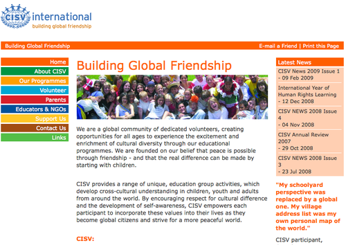
Smashing Magazine lists a top 10 of best practises for non-profit websites. I used this list to see where CISV International's website stands here.

1) Make your site donor-friendly
It takes five clicks to get to the actual donation page, which is hidden under "support us". Then - what a shock: The browser window resizes, and an ugly page with the old CISV logo appears. I wonder if anybody ever makes it past this page. The next page however looks a bit more comforting, but anyway - CISV fails here.
2) Make your site media-friendly
Nothing. No page for journalists. I guess you could find the information and pictures you need somewhere on the website, but I wouldn't call it friendly. Failure again.
3) Make your site volunteer-friendly.
It does take several clicks to get to the page with the link to the NAs, but there are several pages dedicated on how to become a volunteer in CISV, and what we have to offer. So yes, the page is volunteer-friendly.
4) Make sure your organization's purpose is immediately apparent
On the front page. Good.
5) Make sure your content takes center stage.
The design isn't exactly exiting, and the pictures are small. The menu is boring, so yes content takes center stage.
6) Make sure your website is consistent with your other promotional material.
Ever since the rebranding we're quite consistent.
7) Know your site's purpose up front
This one is hard to answer, because I wasn't involved in the design process. In fact the purpose of the international website could easily be questioned: CISV is a local organisation, with chapters and real people. What use is there for an international website except to direct people to their NAs and chapter's website. I'm afraid I can't call this a success, because this website tries to be everything at once, and I can't see an overall concept behind it. I would prefer to see an international website that is stripped down to navigating the people to where they belong: CISVers to the friends website, volunteers to the resources website, newcomers to the NAs website.
8) Include a news section or blog.
Yes there is "Latest News", but this is rarely updated and quite dull. Hmmm. More like failure.
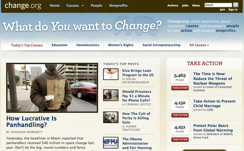
So, counting these points together, I end up with 4/8 successes. Room for improvement, I'd say! Check out the NGO websites mentioned at Smashing Magazine, from Greenpeace to Save the Children - most of which look fantastic and do fulfill the suggestions given. Personally I like the change.org website pictured below.

Germany's website is also about at 3-4/8. How does your NA's website meet these criteria, have you checked?

1) Make your site donor-friendly
It takes five clicks to get to the actual donation page, which is hidden under "support us". Then - what a shock: The browser window resizes, and an ugly page with the old CISV logo appears. I wonder if anybody ever makes it past this page. The next page however looks a bit more comforting, but anyway - CISV fails here.
2) Make your site media-friendly
Nothing. No page for journalists. I guess you could find the information and pictures you need somewhere on the website, but I wouldn't call it friendly. Failure again.
3) Make your site volunteer-friendly.
It does take several clicks to get to the page with the link to the NAs, but there are several pages dedicated on how to become a volunteer in CISV, and what we have to offer. So yes, the page is volunteer-friendly.
4) Make sure your organization's purpose is immediately apparent
On the front page. Good.
5) Make sure your content takes center stage.
The design isn't exactly exiting, and the pictures are small. The menu is boring, so yes content takes center stage.
6) Make sure your website is consistent with your other promotional material.
Ever since the rebranding we're quite consistent.
7) Know your site's purpose up front
This one is hard to answer, because I wasn't involved in the design process. In fact the purpose of the international website could easily be questioned: CISV is a local organisation, with chapters and real people. What use is there for an international website except to direct people to their NAs and chapter's website. I'm afraid I can't call this a success, because this website tries to be everything at once, and I can't see an overall concept behind it. I would prefer to see an international website that is stripped down to navigating the people to where they belong: CISVers to the friends website, volunteers to the resources website, newcomers to the NAs website.
8) Include a news section or blog.
Yes there is "Latest News", but this is rarely updated and quite dull. Hmmm. More like failure.
So, counting these points together, I end up with 4/8 successes. Room for improvement, I'd say! Check out the NGO websites mentioned at Smashing Magazine, from Greenpeace to Save the Children - most of which look fantastic and do fulfill the suggestions given. Personally I like the change.org website pictured below.

Germany's website is also about at 3-4/8. How does your NA's website meet these criteria, have you checked?

It sounds to me like Nick is volunteering! :)
I agree with you Nick--the thing we are missing is a personal connection to the work and mission of the organization. In addition, we are missing a "what's going on now" section that would be useful for volunteers and potential members alike.
The quotes found on several of the pages do only a little justice at telling people what we do. I know that I myself could write page upon page of personal insight, stories, or more about my experiences related to CISV.
Take a look at one of CISV's main "competitors" websites in the cross-cultural education field:
http://www.ptpi.org/
While the site itself seems a bit crowded for my eye, it does an awesome job of directing people where they need to go, immediately.
Unfortunately, the biggest issue we face on the web development front is that much of what we want to see on our websites (I speak for the USA as well...) cannot be done by volunteers alone. I've yet to encounter a trustee willing to part with the money for a professional web developer either...
I would...
I would = to Martin's comment