It's fun to see that the new generation of CISVers are so media-wise (not like us idiots), they can actually make use of all the great tools of the web. Best example, the following video featuring JBcommunity:
January 2009 Archives
It's fun to see that the new generation of CISVers are so media-wise (not like us idiots), they can actually make use of all the great tools of the web. Best example, the following video featuring JBcommunity:
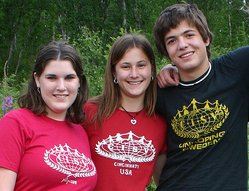
At first glance all three CISV logos in this picture look identical. But if you take a closer look you can see marginal differences, and in fact, I think this picture shows the three last official version of the CISV logo before the rebranding took place in 2006.

Before diving into the history, I would like to showcase the logo of the United Nations. I think it goes without question, that this has been the original inspiration for the CISV logo. In the fiftees the United Nations had just been founded and probably caried the same hope for a peaceful globe that lead to the creation of CISV. Some more obnoxious inviduals claim that the CISV-logo is the UN-logo - after someone sat on it.
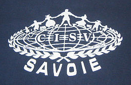
This version is really old. I only found it once - on a CISV shirt that was probably printed in the sixtees. I'd love to know if this was the original first version of the CISV logo.

Again, I'm not sure, from when this version is, but it just looks like s slight modification from the previous version.
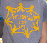
We're lucky with this one, as it has the year printed on it - but it's surely not the official logo at the time. However it has some resemblance of today's logo.
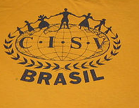
This is a logo from 1979. It includes the famous dots in the continents.
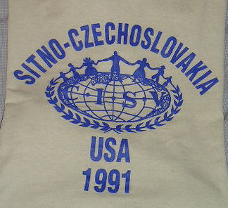
The good thing about this version is, that the shirt tells us exactly when it was printed. I do think that it is still the same logo as 1979, just that the print quality makes the letters C and V almost disappear. However, I'm fairly sure, that when I joined CISV in 1989 this logo had already been modified (without the dots!), so as usual, it takes a few years until a new designs penetrates to all CISV designers around the globe.
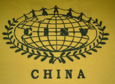
This logo is a big what-the-hell? It has a bit of a sixties/seventies-look, but I'm quite doubtful that China participated in CISV during Mao's cultural revolution. So it's more probably not so old but designed in a retro-look.
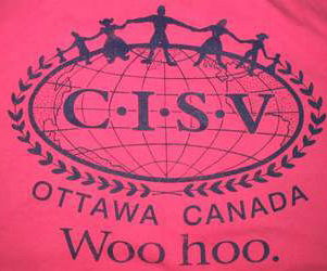
This is just an example of many hand-drawn variations of the CISV logo - this one, I particularly like, because with the thick and thin lines it looks very elegant.

This is the official updated version of CISV logo, with a more precise and sharper "look and feel". It must have been created in the late 1980s. When you stare at it for a while you do wonder - why does the I hate the S? The space between those two letters just seems to be a bit to wide. Another interesting asspect is that the laurel branches are asymmetrical.

In 2001 Doris Allen turned 100 years old and CISV 50 - so here is the anniversary logo. It includes the official logo, with the small variation, that the continents are solid.


These are several options that were presented to CISVers around the world in 2005 as a new visual identity. Of course people around the CISV world complained. I even remember receiving an e-mail from a participant from the very first camp, saying that the logo should not be modified at all. Well...obviously it was, and not for the first time...but not as much as proposed here.
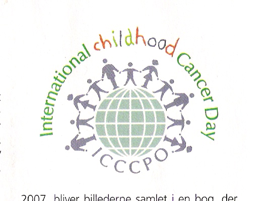
Obviously, we're not the only ones who deal with children around the globe. This logo looks familiar, doesn't it?

Finally, this is today's CISV logo, which was presented in 2006 as part of a rebranding process, that also brought us the "building global friendship" tagline. The rationale of updating the logo included to make it readable, even if the logo is printed very small. And you can see that the ratio between the letters CISV and the logo itself has shifted towards the lettering. Also, the traditional costumes were dropped, and the people on top of the CISV world all look the same. Looking at the history of the logo, this last modification was probably the most radical in the history of CISV. I know a lot of people hated it at the beginning, but as usual - people just get used to change.
- IO contact information at the bottom
- Colors coding what is really new
- Format change from .doc to .pdf
The newsletter is a key information tool inside the organization, and contains a ton of really important information, so why the hell is it designed to bad? So, dear IO, if you read this, here are my suggestions:
- Scrap the PDF and put the content directly into the e-mail. We've passed the age where only information is regarded important if inside a document. And if some people still do, why must everybody else suffer? A newsletter is much more readable if it can be found directly in the body of an e-mail. It's not like the layout is very fancy or anything, in fact, the two-column layout is crap for screen-reading and for the love of the rain-forest - printing IO-updates should not be encouraged.
- Scrap the color-codes. If information is really really important, then publish it twice. But the color codes only make people read the red text only (at least I do). Also, important stuff, like date changes, should be communicated through several different means - like through a website, through a camp-e-mail list, through the committees...whatever, just not three times in a row through the same means.
- Sort the deadlines underneath the respective headings not all together at the beginning. This will allow people in specific position (e.g. chapter seminar camp chair) to concentrate on that section of the IO update.
In 1996 I participated in my first NJBC (national junior branch conference) in Germany. I joined a working group that discussed the question whether CISV could make any money by selling its name to a corporation in the sense that a corporation would give CISV money in order to be able to say: We are not an evil company, because we support CISV. The general opinion in our working group was: Who the hell would pay for the name CISV, that nobody has ever heard of?
Now...please have a look at this video.
I have no clue what or if CISV got anything for it, but isn't it a bit irritating?
On the other hand: Jakob Nielsen, an internet usability guru, recently tested company intranets, and almost half of the winners use Micsrosoft Sharepoint. So I guess it's cool that we are using that software.
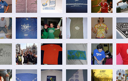
Today the CISV shirts archive is exactly four years old. With more than 400 shirts online, there's enough reason to be proud. However, only a few shirts have been added this last year, and although the number of daily visitors (10-15) is quite constant, I wonder if there are ways to make the website more interesting. I've been thinking of making the website more into a database, than a blog, where you can search by country, by year or even by color. On the other hand that would require a lot of work, and I'm not sure too many people are interesting in "datamining" the CISV shirt archives...in the end, I guess, the best way would be to have new shirts uploaded. So anybody reading this - got some CISV shirts and a digital camera (odds are, that you do have both!), please mail them in or upload them directly...directions to be found here. Any other ideas to improve the website? Please leave your comments.
 Today I found Anna wearing a button with a silly robot on, and she explained that this was the character from a video from last AIM explaining why IYM should become a programme. The video is available on the IYM website - and - wow, quite a nice piece of work there...
At this point I should explain, that after being on the IPP taskforce for so long, we always viewed youth meeting as our competition in becoming a programme. It was an easy match - at least in our eyes - as youth meetings were (or maybe still are), expensive and nobody could ever really define what their unique content was - except that it was short. To cut a long story short, In 2008 both youth meeting and IPP became official programmes, so I guess it's a tie.
Watching the video and flipping through the website brought up two other throughts...
- IYMs are promoted as a "regional programme" - that is interesting. Who can afford to take part in a one-week programme, that takes place in oversees? It makes a ton of sense to have IYMs structured regionally. That also gives Youth meetings a unique place within CISV and stengthens regional identity.
- On the website you can also find the educational theme (WiFight) with a content package, that gives staffs, leaders and participants tools to create strong, content-rich activities in the range of the theme. I'm not sure this is the general idea, but I would love to see Youth Meetings pick a new theme every year and have all youth meetings work on that theme. In that sense, Youth Meetings have the potential of bringing CISV closer to real life than any other programme. Not too long ago (I think in 2003) the Local-Work committee presented a video that confrontet the CISV world with the fact, that maybe CISV is a little disconnected with what is happening in the real world. The central point of the discussion was, whether CISV could try to implement current themes, such as the Iraq war, the Taliban or genetic engineering without getting political. I don't want to dig too deep into that, but I'd love to see IYMs continue where the Local Work discussion ended. Youth Meetings could be the ideal place to bring the "real world" into CISV. Let the villages do the pony game, Summer camps the lifeboat, Seminar camps discuss the death penalty (*yawn*) - Youth Meetings may be the future!
I also posted a link to this website, and I'm curious how many visitors will show up.
